3.31.2008

Artist's Website IV- Andrew Bird


This is the cover art of the album, "Andrew Bird & The Mysterious Production of Eggs", one of my all time favorite musicians. I really like his website, especially how it forces you to search for the navigation bar. You have to roll over it in order for it to appear again after first visiting a page. I'm not a huge fan of the black background, but I'm sure it appeals to a lot of people and it does seem really easy to read. you should check out the AV page and listen to the jukebox.

3.26.2008

Artist Website III- Lisa Solomon

Lisa Solomon is another candidate for the painting department at SFSU, so I got the opportunity to see her speak about her work as well.
Lisa's website is one of those nice and clean artist's websites that is so amazingly simple, but I wonder if it's accessible to
everyone. You could very easily go to the main page and think that all that existed in the whole site was her name and a little scroll box. You almost have to look around a bit to discover that there's more to it, but maybe there's some psychology behind that idea as well. Like, a person visiting your site could somehow feel accomplished by discovering secret rooms and therefore feel a strange attachment to it.

I was excited to discover through visiting her website, th
at I own a t-shirt that she designed, a gift from Rob a few years ago. cute.

3.24.2008

Artist Website II- BrionRosch

In keeping with the practice of checking out artists' website design over the break, I decided to start local, with someone that I know and used to work with. You can check out his website here. (Brion, if you read this, sorry to use you first!)
I really like the simple, easy design of the site and am a BIG fan of his color palette. (BTW, his bike matches his work) Some of the choice of font color is a little light, making it hard to read, but that could just be my aging eyesight.
A plus about this site in my circumstances, is that there's a teeny image in the upper right hand corner that links you to the web designer's site, showing other artists' websites. Nice job. A++

3.21.2008

Artists Website I

One artist's website that I look at often is local artist, Josh Keyes. I received a print of his as a gift last year, and have been following him since. You can visit his site here.
When viewing his site's use of meta tags, I noticed that some of his keywords were the names of some of his contemporaries and artists that he's been in shows with. Which I've never thought of doing, but I suppose makes perfect sense. Here is an image of the print that is hanging in my living room.

3.19.2008

Visiting artist lecture


Yesterday I went to see Claire Sherman speak. She is a candidate for the professor position in the painting department, I assume to replace one of my favorites ever, Paul Pratchenko. I recognized her work from "New American Paintings" from about a year ago. The image above is one of my favorite pieces of hers, but you can check out her website here.
It was interesting to listen to her talk about her thoughts about surface and the use of paint as a material that can be used to break up an image, becoming just paint. She experiments with incredibly thick applications, almost to the loss of control. Her work is on the border between abstraction and representation.
I think that she would be a good fit with the painting department. It's too bad I'm outta there. I think that I'd really enjoy a class with her.

3.17.2008

Running Marathons...

I haven't mentioned much of this part of the title of my blog, so here goes...
I've officially kicked off the training season for two marathons and one half marathon coming up this year. Which basically means that I'm going to start doing a whole lotta running and tons of cross training and eating really well (and eating a lot). I find that I'm constantly starving while I'm in this process and pretty much spend the day snacking. I also sleep really well at night, and feel incredibly motivated with personal projects. One project that is in the works involves mapping my runs from point to point to see what sort of patterns develop.

For this particular training program, I'm a pace group leader. This means that between myself and two other pacers, we keep anywhere from 15 to 35 runners on track for the long runs, which happen on Saturdays. This also means that my Friday nights are shot because I have to be all set to go at 8:00am. I work or have school 6 days a week with Saturdays being my only day off. So by the afternoon, I feel very accomplished and I can actually let myself chill out and relax a little.

The little project that could....

My newest textiles project that has been eating away at my brain involves a self-portrait done in embroidery. Having been an art student for so many years, the number of times that I've been instructed to do a self-portrait is too many to count, but this one is a whole new venture; portraiture is hard as it is. I've decided that because I've had the opportunity to do so many figure studies, I should take advantage of this knowledge and try to work as realistically as possible.
But I've had a hard time working this one out. All of my sketches are rendered the way that I want them to be in pencil, but I know that the translation from sketch to embroidery thread is going to be hard to manipulate.
I finally settled on the idea to create this piece as if it were a drawing/sketch from one of my notebooks. So I started by creating a college-ruled piece of notebook paper with my sewing machine. Here's a picture of the beginning:


The final piece won't include all of the loose ends, but you get the idea. The rest of the piece will be made up of embroidered versions of actual sketches from my notebooks from the last few years. I'm looking forward to going through my notebooks to revisit my thoughts and ideas from the past.

3.10.2008

Artist Statement

I've been revising my artist statement slowly over the weekend and I'm pretty happy with the outcome. I really like the idea of having a statement that is eloquent but short and sweet. I have a subscription to the magazine, "New American Paintings", and just received one in the mail last week. Each issue is done regionally and is juried by a guest curator. It's more like a catalog than a magazine, done alphabetically ordered with 3 pieces per artist and includes a C.V., bio and statement for each artist. It's been a great reference for me. Some of them are a little more flowery than I'd like my own to be, but nonetheless, helpful to read. I'm going out of town this Wednesday, so I'm going to miss the second artist statement workshop, which is sad. Maybe I can get someone to give me private feedback?
I drove up to Gail Dawson's show at the Dominican University in San Rafael this Saturday. Having been a student of hers for a couple of years and only having seen one live piece of her work, it was great to see it up close and personal. I was totally blown away by the amount of work that goes into the video pieces. 24 (?) paintings only take up one second of video. That's a huge project to tackle.

3.07.2008

I heart textiles

In preparation for having to create an embroidered self-portrait for my textiles class, I've started a little side project/practice session. I can remember embroidering pillow cases and handkerchiefs with my mom when I was little; the time when I lived for baking cookies, napping in the garden and playing with the cat. It was a rough life.
Now I'm attempting to treat thread as I would treat paint or a pencil. Each stitch is like a brush stroke. I'm making up my own and reintroducing the classic stitches into my vocabulary. I did this piece in the Fall that ended up as part of a series that was in the Stillwell show:

I really enjoyed this and have wanted to explore it further. I like the idea of working with one continuous piece of thread, the thought that if one area is snipped, the whole thing falls apart. It speaks of fragility and impermanence, two things that I've been dealing with lately in my work.

3.06.2008

Phase V

I have to say, I appreciate Gilbert & George a whole lot more having waited few days after seeing the show. Mainly because I truly haven't stopped thinking about it since and I've enjoyed hearing what other people have said about their experiences. There is another amazing thing that I found out since I visited the De Young. Do you remember a while ago when they banned hoodie wearing in London? They actually made this illegal. You would get arrested if you were wearing a hoodie. Can you imagine? Gilbert & George responded to it:

"They've done nudity, bondage, bad language and turds: now Gilbert and George tackle the latest taboo - hoodies, identified recently by the government as a symbol of the so-called yob culture.

Presumably, Bluewater, the shopping centre which sparked a national debate by banning hoodies - and claims that sales rocketed as a result - wouldn't give wall space to the latest work of art from the men approaching their 40th anniversary as living works of art.

Gilbert and George met in 1967 at St Martin's School of Art, where both were studying sculpture, and they have lived, worked and exhibited together since.

They began as performance artists, showing themselves as living sculptures, but in the past 20 years have produced a series of monumental photography-based pieces.

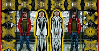
In Hooded, the pair are flanked by capped and hooded figures of young black men, who could be seen as threatening, bemused or wryly amused.

Andrea Rose, director of visual art at the British Council, said: "Gilbert and George have made grand portraits from the hooded boys who live and work around Spitalfields, where the artists themselves have lived and worked together for more than 35 years.

"While others discuss banning youths from wearing hoodies, Gilbert and George find something positive to say about them."

The piece, unveiled yesterday by the British Council, is one of 25 new works made by the artists for the British Pavilion at the Venice Biennale, which opens next month."


Think about how amazing that is.

3.04.2008

Student Night

I decided about 45 seconds ago to submit something. Only because it was probably the easiest submission ever. Just a quick email with an image attachment. I don't quite feel that my work resonates with the work of Gilbert & George, but I do have a piece that has the same sort of graphic, black and white photo quality. It can't hurt, right?

3.03.2008

Phase IV

I went to see the Gilbert & George exhibit on Sunday, and had to run off to work, so I didn't get a chance to write about it then (such is my packed schedule). So, I'll be breaking the rules a bit; first by not getting to the museum by the due date to complete the assignment, and second by not writing immediately after the show (both out of character but such is life).

I was glad that I had the opportunity to research the artists before seeing the exhibition. Seeing as how the work of Gilbert & George could have the ability to offend. One of my classmates told me that he saw many a family turn into the exhibit and then turn right back out. Could it have been the photo montage that included a 20 foot tall cross made of s*^t?

probably.
They're not joking when they say that they "put themselves" into every piece. They incorporate themselves into 99.9% of the work; either by their own image, or their bodily fluids. The fact that they started the former part in the last 15 years, while they were in their late 50's is interesting.
I was not that impressed by the choices they made in color and repetition of image. And then I remembered that a lot of them were done pre-Photoshop and changed my mind. But there was one, that I stood in front of for a while called Existers from 1984:

What does it mean? Why are only their ears, lips and clothing brightly colored? Why is (Gilbert?) on the floor? Why the trendy 80's colors? Why? Thoughts?
One thing that I was thinking a lot about was the way that they explained their idea of "Art For All". They said that this century is plagued by the notion of art being for the few people that are "in the know" and that this secrecy makes it impossible for "normal people" to understand art. Think Marcel Duchamp's "Fountain". Their work is most definitely not as simple as Jeff Koons or Thomas Kincade, the people that I think of as making easily understandable "Art for All". Do you want something to be so obvious upon first glance that it doesn't teach you anything or make you think differently? This is definitely the part that I appreciate most about art. So does this mean that conceptually, their work is more shallow than I think?
I definitely enjoyed watching peoples' reactions to the work and the scale was pretty amazing. I'm also really excited that I purchased a membership, and I only live 1.5 miles away. Morning trips will be a must.

not much...


I worked all weekend, so I don't have much to say, but here's an image of something that I made a while ago. It's done in watercolor and colored pencil. It's from a picture of my mom from 1980. This was an assignment that I gave myself to try and mimic the renegade colors from that were used in photo printing during that time.
I love that when I look through old family pictures, my mom seems to have the newest trendy hair style in every one, and as some can remember, there were some outrageous styles going on. Perms included.